Bootstrap from Twitter is a free collection of tools for creating websites and web
applications. It contains HTML and CSS-based design templates for typography,
forms, buttons, navigation and other interface components, as well as optional
JavaScript extensions.
By default, Bootstrap is integrated into ASP.NET web projects in Visual Studio 2013.
In this article we’ll explore the options:
1. Create a new ASP.NET Web Application in Visual Studio 2013
2. Select Web Forms as template
3. Once the project is created, you will see the Summary Page
4. Run the project and you can see the project layout is already integrated with
Bootstrap and the default bootstrap theme is applied.

Installing additional Bootstrap themes
Visual Studio 2013 comes with a single default bootstrap theme (bootstrap.css). Developers
has the following options to change the theme:
1. Modify bootstrap.css according to your needs
2. Create own CSS file and replace bootstrap.css
3. Download free bootstrap theme file from 3rd party sites
We’ll explore the 3rd option here:
1. Go to http://bootswatch.com/ and download some free themes, for example Slate or Amelia
2. Rename the files to bootstrap-amelia.css and bootstrap-slate.css
3. Copy these files into the Contents folder of your project
4. Open Bundle.config file from your project and replace bootstrap.css to bootstrap-amelia.css. Your Bundle.config
file should look like this:
<?xml version="1.0" encoding="utf-8" ?>
<bundles version="1.0">
<styleBundle path="~/Content/css">
<include path="~/Content/bootstrap-amelia.css" />
<include path="~/Content/Site.css" />
</styleBundle>
</bundles>
5. Run the project to see the new theme applied
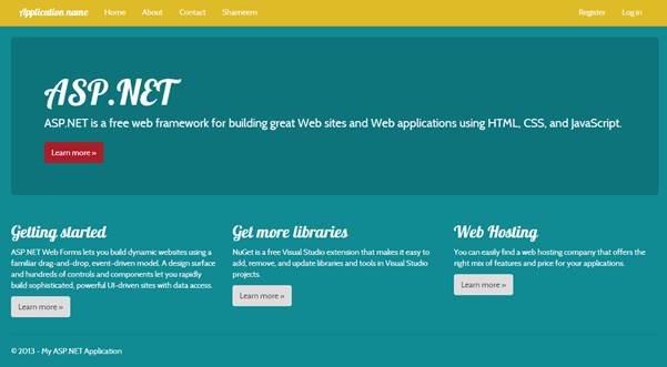
6. Try changing the theme in Bundle.config to Slate (we’ve downloaded earlier) and see how easy it is to apply different themes.
Also try modifying the downloaded CSS files to get familiar with bootstrap theming
concepts.
Using Bootstrap components in ASP.NET pages
In the rest of the article, we’ll explore some of the different components available
in bootstrap and use them in ASP.NET pages. For more information about Bootstrap
check the official site http://getbootstrap.com
Using Bootstrap Grid System
Bootstrap includes a responsive, mobile first fluid grid system that appropriately
scales up to 12 columns as the device or viewport size increases. It includes
predefined classes for easy layout options, as well as powerful mixins for generating
more semantic layouts.
For better visualizing the Grid System add the following CSS classes in Site.css in Contents folder of your project:
.cell1
{
border: solid thin black;
padding: 5px;
}
Insert the following code in your MainContent area in Default.aspx or create a new ASPX file:
<h1>Bootstrap Grid System</h1>
<div class="row">
<div class="col-md-1 cell1">.col-md-1</div>
<div class="col-md-1 cell1">.col-md-1</div>
<div class="col-md-1 cell1">.col-md-1</div>
<div class="col-md-1 cell1">.col-md-1</div>
<div class="col-md-1 cell1">.col-md-1</div>
<div class="col-md-1 cell1">.col-md-1</div>
<div class="col-md-1 cell1">.col-md-1</div>
<div class="col-md-1 cell1">.col-md-1</div>
<div class="col-md-1 cell1">.col-md-1</div>
<div class="col-md-1 cell1">.col-md-1</div>
<div class="col-md-1 cell1">.col-md-1</div>
<div class="col-md-1 cell1">.col-md-1</div>
</div>
<div class="row">
<div class="col-md-8 cell1">.col-md-8</div>
<div class="col-md-4 cell1">.col-md-4</div>
</div>
<div class="row">
<div class="col-md-4 cell1">.col-md-4</div>
<div class="col-md-4 cell1">.col-md-4</div>
<div class="col-md-4 cell1">.col-md-4</div>
</div>
<div class="row">
<div class="col-md-6 cell1">.col-md-6</div>
<div class="col-md-6 cell1">.col-md-6</div>
</div>
Run the project to see Grid system in action. Try resizing the page to see how Grid
response to the viewport size accordingly.
Using Bootstrap Tables
There are 4 bootstrap table classes we can use table, table-striped, table-bordered & table-hover. Try each one of them by changing the class in Table tag with the following code
in your asp.net page:
<h1>Bootstrap Table</h1>
<table class="table table-hover">
<thead>
<tr><td><strong>#</strong></td><td><strong>First
Name</strong></td><td><strong>Last Name</strong></td></tr>
</thead>
<tr><td>1</td><td>Shameem</td><td>Ahmed</td></tr>
<tr><td>2</td><td>Gary</td><td>Cambell</td></tr>
<tr><td>3</td><td>David</td><td>Greedwood</td></tr>
</table>
Using Bootstrap Buttons
Bootstrap provides 7 CSS classes for buttons Default, Primary, Success, Info, Warning,
Danger & Link. Add the following code in your asp.net page and run the project
to see the buttons in action:
<h1>Bootstrap Buttons</h1>
<button type="button" class="btn btn-default">Default</button>
<button type="button" class="btn btn-primary">Primary</button>
<button type="button" class="btn btn-success">Success</button>
<button type="button" class="btn btn-info">Info</button>
<button type="button" class="btn btn-warning">Warning</button>
<button type="button" class="btn btn-danger">Danger</button>
<button type="button" class="btn btn-link">Link</button>

Using Bootstrap Images
Bootstrap provides 3 CSS classes for images Round, Circle & Thumbnail. Add the
following code in your asp.net page and run the project to see the images in
action, Add an image into your project Images folder in this case (images\photo01.jpg):
<h1>Bootstrap Images</h1>
<img src="images\photo01.jpg" class="img-rounded">
<img src="images\photo01.jpg" class="img-circle">
<img src="images\photo01.jpg" class="img-thumbnail">
Bootstrap also provides responsive images that resizes automatically according to
the viewport size. Check their official site http://getbootstrap.com/css/#overview-responsive-images for more details.
Using Bootstrap Alerts
Bootstrap provides alerts classes similar to buttons (Success, Info, Warning &
Danger). Add the following code in your asp.net page and run the project to see
alerts in action:
<h1>Bootstrap Alerts</h1>
<div class="alert alert-success">Success Alert</div>
<div class="alert alert-info">Info Alert</div>
<div class="alert alert-warning">Warning Alert</div>
<div class="alert alert-danger">Danger Alert</div>

Using Bootstrap Models
Bootstrap provides Stylized Model windows that replaces traditional model window
technics. Add the code below in your asp.net page and run the project to see
alerts in action:
<h1>Bootstrap Model Window</h1>
<!-- Button trigger modal -->
<button class="btn btn-primary btn-lg" data-toggle="modal"
data-target="#myModal">
Launch modal window
</button>
<!-- Modal -->
<div class="modal fade" id="myModal" tabindex="-1"
role="dialog" aria-labelledby="myModalLabel" aria-hidden="true">
<div class="modal-dialog">
<div class="modal-content">
<div class="modal-header">
<button type="button" class="close" data-dismiss="modal"
aria-hidden="true">×</button>
<h4 class="modal-title" id="myModalLabel">Modal window
title</h4>
</div>
<div class="modal-body">
Model window body content goes here...
</div>
<div class="modal-footer">
<button type="button" class="btn btn-default" data-dismiss="modal">Close</button>
<button type="button" class="btn btn-primary">Save changes</button>
</div>
</div><!-- /.modal-content -->
</div><!-- /.modal-dialog -->
</div><!-- /.modal -->
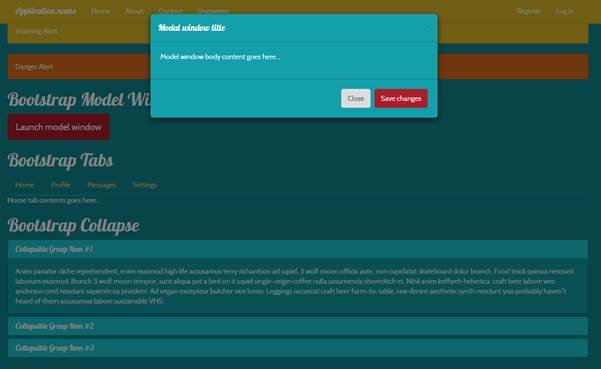
Click on Launch Model Window button to open the model window.
Using Bootstrap Tabs
Bootstrap provides Tabs components using which you can create Tabbed interfaces in
your asp.net projects. Add the code below in your asp.net page and run the project
to see Tabs in action:
<h1>Bootstrap Tabs</h1>
<!-- Nav tabs -->
<ul class="nav nav-tabs">
<li><a href="#home" data-toggle="tab">Home</a></li>
<li><a href="#profile" data-toggle="tab">Profile</a></li>
<li><a href="#messages" data-toggle="tab">Messages</a></li>
<li><a href="#settings" data-toggle="tab">Settings</a></li>
</ul>
<!-- Tab panes -->
<div class="tab-content">
<div class="tab-pane active" id="home">Home tab contents
goes here...</div>
<div class="tab-pane" id="profile">Profile tab contents
goes here...</div>
<div class="tab-pane" id="messages">Messages tab contents
goes here...</div>
<div class="tab-pane" id="settings">Settings tab contents
goes here...</div>
</div>
Using Bootstrap Collapse
Bootstrap Collapse provides stylized collapsible panels seen in modern web UIs like
gmail or MSDN where you can collapse or expand emails or code area etc. Add the
code below in your asp.net page and run the project to see Collapse in action:
<h1> Bootstrap Collapse</h1>
<div class="panel-group" id="accordion">
<div class="panel panel-default">
<div class="panel-heading">
<h4 class="panel-title">
<a data-toggle="collapse" data-parent="#accordion" href="#collapseOne">
Collapsible Group Item #1
</a>
</h4>
</div>
<div id="collapseOne" class="panel-collapse collapse in">
<div class="panel-body">
Anim pariatur cliche reprehenderit, enim eiusmod high life accusamus terry richardson
ad squid. 3 wolf moon officia aute, non cupidatat skateboard dolor brunch. Food
truck quinoa nesciunt laborum eiusmod. Brunch 3 wolf moon tempor, sunt aliqua
put a bird on it squid single-origin coffee nulla assumenda shoreditch et. Nihil
anim keffiyeh helvetica, craft beer labore wes anderson cred nesciunt sapiente
ea proident. Ad vegan excepteur butcher vice lomo. Leggings occaecat craft beer
farm-to-table, raw denim aesthetic synth nesciunt you probably haven't heard
of them accusamus labore sustainable VHS.
</div>
</div>
</div>
<div class="panel panel-default">
<div class="panel-heading">
<h4 class="panel-title">
<a data-toggle="collapse" data-parent="#accordion" href="#collapseTwo">
Collapsible Group Item #2
</a>
</h4>
</div>
<div id="collapseTwo" class="panel-collapse collapse">
<div class="panel-body">
Anim pariatur cliche reprehenderit, enim eiusmod high life accusamus terry richardson
ad squid. 3 wolf moon officia aute, non cupidatat skateboard dolor brunch. Food
truck quinoa nesciunt laborum eiusmod. Brunch 3 wolf moon tempor, sunt aliqua
put a bird on it squid single-origin coffee nulla assumenda shoreditch et. Nihil
anim keffiyeh helvetica, craft beer labore wes anderson cred nesciunt sapiente
ea proident. Ad vegan excepteur butcher vice lomo. Leggings occaecat craft beer
farm-to-table, raw denim aesthetic synth nesciunt you probably haven't heard
of them accusamus labore sustainable VHS.
</div>
</div>
</div>
<div class="panel panel-default">
<div class="panel-heading">
<h4 class="panel-title">
<a data-toggle="collapse" data-parent="#accordion" href="#collapseThree">
Collapsible Group Item #3
</a>
</h4>
</div>
<div id="collapseThree" class="panel-collapse collapse">
<div class="panel-body">
Anim pariatur cliche reprehenderit, enim eiusmod high life accusamus terry richardson
ad squid. 3 wolf moon officia aute, non cupidatat skateboard dolor brunch. Food
truck quinoa nesciunt laborum eiusmod. Brunch 3 wolf moon tempor, sunt aliqua
put a bird on it squid single-origin coffee nulla assumenda shoreditch et. Nihil
anim keffiyeh helvetica, craft beer labore wes anderson cred nesciunt sapiente
ea proident. Ad vegan excepteur butcher vice lomo. Leggings occaecat craft beer
farm-to-table, raw denim aesthetic synth nesciunt you probably haven't heard
of them accusamus labore sustainable VHS.
</div>
</div>
</div>
</div>
Summary
Bootstrap is one of the powerful front-end UI framework and is the most popular project
on GitHub and has been used by NASA and MSNBC among others. It’s also one of
the sought after skills for web developers.
Learning Bootstrap is easy and now that Visual Studio 2013 integrates it officially
into their ASP.NET web applications .Net developers should adapt to Bootstrap
and try to master the framework.